Creating a heatmap in Excel on Windows
To create a heatmap in Excel:
-
Log in to Black Duck with the System Administrator role.
-
Extract the logs to a folder.
-
Open a new and blank workbook using Microsoft Excel. Using other spreadsheet/workbook programs may yield different results or differ in the steps below.
-
On the first top empty cell of an empty worksheet:
-
Click the Data tab > Get Data > From File > From Text/CSV
-
Navigate to the location of your download logs folder/debug folder
-
Select the Heatmap CSV file (scan-heatmap-YYYY-MM-##########.csv)
-
Click Import
-
-
From the Import Wizard perform following:
-
Ensure that the Delimiter dropdown is set to Comma
-
Click the Load button
-
-
Select the entire data that has been imported
-
Click the Insert tab
-
Click the PivotTable icon
-
In the Create PivotTable modal that appears:
-
Ensure the Select a table or range radio button is selected with the appropriate selected field
-
In the Choose where you want the PivotTable report to be placed section, select the New Worksheet
-
Click the OK button.
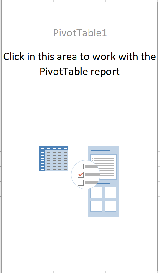
Your worksheet should look like this:
-
-
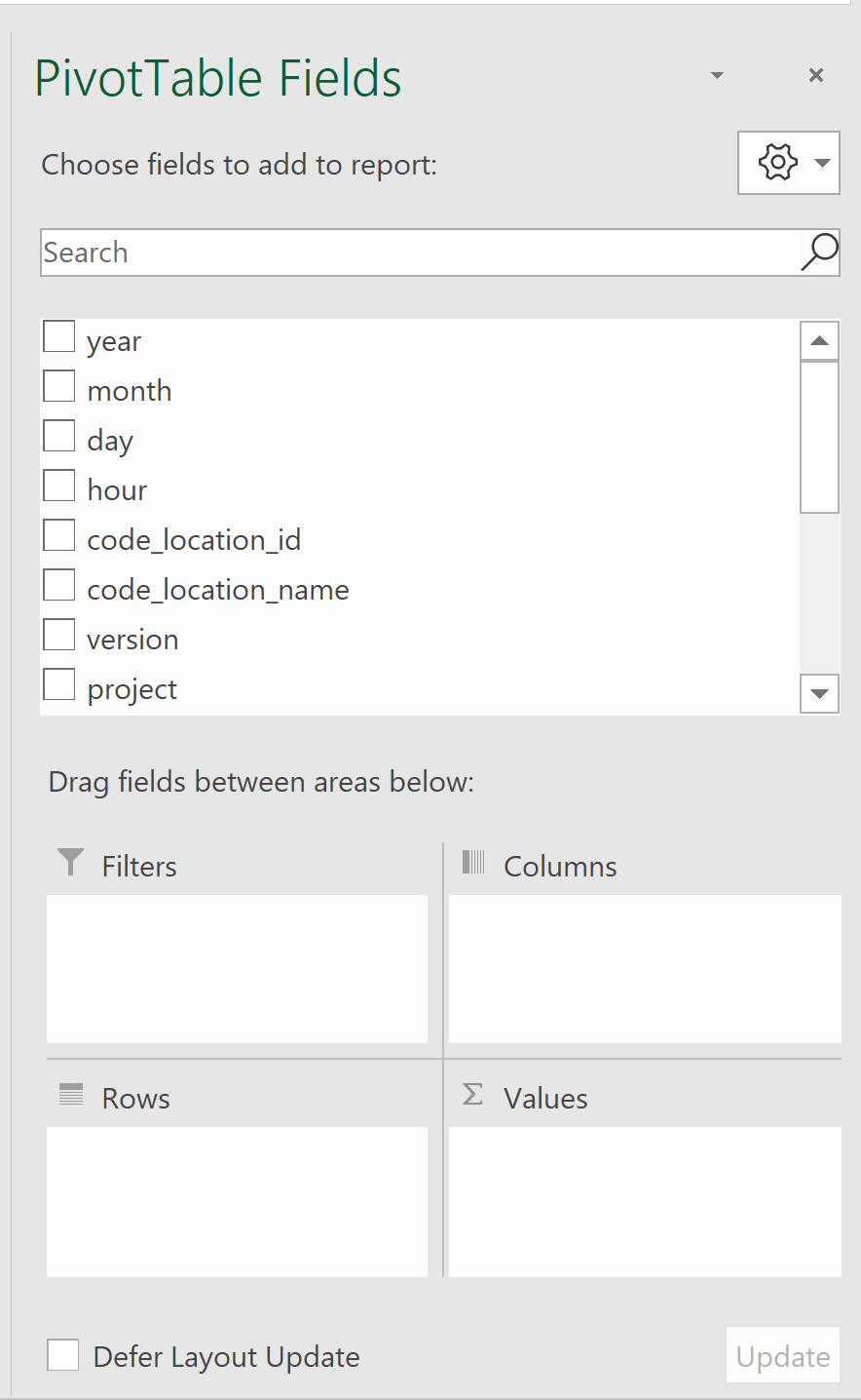
Click in the Blank Pivot created, this should open the PivotTable Fields column panel.
-
Drag the following to the Filters section in this order:
-
Year
-
Month
-
Scan_Type
-
Status
-
Status_Message
-
Project, Version
-
Code_Location_Name
-
-
Drag the Hour field to the Columns section.
-
Drag the Day field to the Rows section.
-
Drag the Scans field to the Values section. It should show as ‘Sum of Scans’.
-
Rename the column header from 'Row Labels' to Days
-
Rename the 'Column Labels' filter in second column to Hours
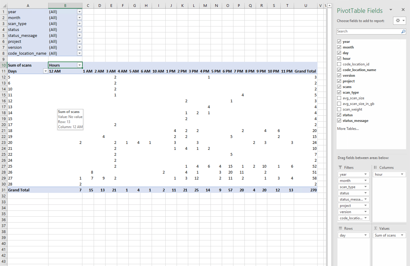
The presentation in Excel should now look like this:
-
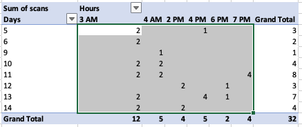
Select all the cells that fall within the range between the first to last Hours column (do not include filter top row, ‘Grand Total’ bottom row or last column (Grand Total)
-
Click the Home menu item
-
From the Conditional Formatting > Color Scales, select Red - Yellow - Green scale
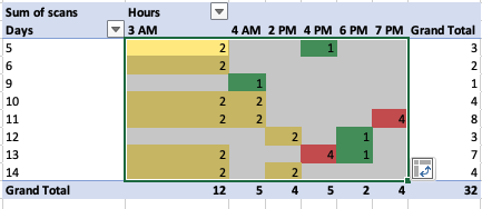
-
Select the cells in bottom Grand Total row and apply the same color scale (excluding first and last column. Only Hours data cells).
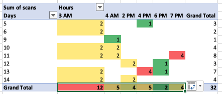
-
Select the cells in the rightmost Grand Total column and apply the same color scale.
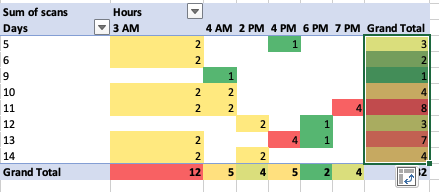
-
Select the bottom right corner cell alone and provide it with a blue background.
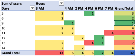
-
To analyze the data behind any cell, double click on it.
Maximum Scan Size Heatmap
-
Add a blank new sheet to the workbook.
-
In the new worksheet, click on any cell, click on Insert tab, click on Pivot icon.
-
Click on the Blank Pivot created, this should open the Pivot column panel.
-
Drag the following to filter section in this order:
-
Year
-
Month
-
Scan_Type
-
Status
-
Status_Message
-
Project
-
Version
-
Code_Location_Name
-
-
Drag the Hour field to the Columns section.
-
Drag the Day field to the Rows section.
-
Drag avg_scan_size_in_gb field to the Values section
-
Change to show Maximum such that it should display ‘Max of avg_scan_size_in_gb’:
-
Click on the field in the values section. This will launch the PivotTable field.
-
Choose Maximum instead of Sum.
-
Click the OK button.
-
-
Select all the cells that fall within the range between the first to last Hours column (do not include filter top row, ‘Grand Total’ bottom row or last column (Grand Total)
-
Click the Home tab, Conditional Formatting > Color Scales > Yellow - Green color scale.
-
Select the cells in bottom Grand Total row and apply the same color scale.
-
Select the cells in the rightmost Grand Total column and apply the same color scale.
-
Select the bottom right corner cell alone and provide it with a blue background.
Scan Weight Heatmap
-
Add a blank new sheet to the workbook.
-
In the new worksheet, click on any cell, click on Insert tab, click on Pivot icon.
-
Click on the Blank Pivot created, this should open the Pivot column panel.
-
Drag the following to filter section in this order:
-
Year
-
Month
-
Scan_Type
-
Status
-
Status_Message
-
Project
-
Version
-
Code_Location_Name
-
-
Drag the Hour field to the Columns section.
-
Drag scan_weight field to the Values section and change to show Maximum such that it should display ‘Avg of scan_weight’. This can be set by clicking on the field in the values section and then choosing Average instead of Sum.
-
Drag the Scans field to the Values section. It should show as ‘Sum of Scans’.
-
Select all the cells that fall within the range between the first to last Hours column (do not include filter top row, ‘Grand Total’ bottom row or last column (Grand Total)
-
Click the Home tab, Conditional Formatting > Color Scales > Red - White color scale.
-
Select the cells in bottom Grand Total row and apply the same color scale.
-
Select the cells in the rightmost Grand Total column and apply the same color scale.

